Visual Rebrand & Advertising Redesign
— CookDevcook
I redesigned CookDevcook’s branding visuals and ad creatives to build a more playful, childlike, and approachable identity. The refreshed direction uses bold typography, cheerful colour blocking, and a friendly mascot-style illustration system to strengthen brand recognition and create a light, energetic tone across campaign assets. I developed a cohesive set of brand applications—including key visuals, pattern explorations, and mockups—ensuring consistency across both digital and print touchpoints while making the brand feel more fun, memorable, and shareable.
Goal & Problem
CookDevcook’s existing visuals lacked a consistent, instantly recognisable identity across ads, and the overall tone felt less engaging for a younger, more social-first audience. My goal was to improve brand consistency, strengthen first-glance recognition, and make campaign creatives more eye-catching and readable in fast-scrolling environments.
Design Approach
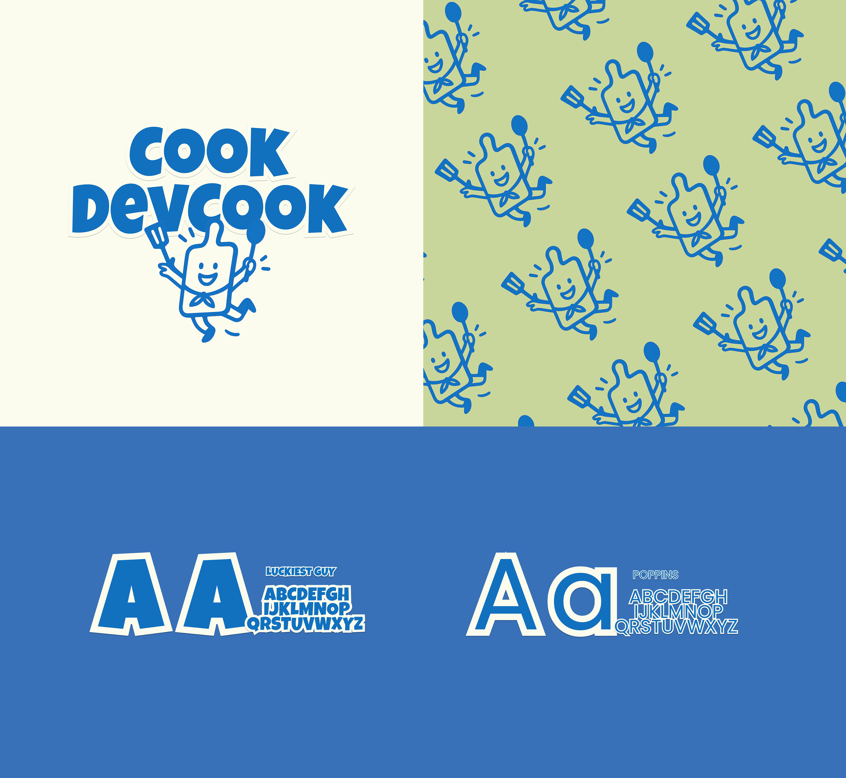
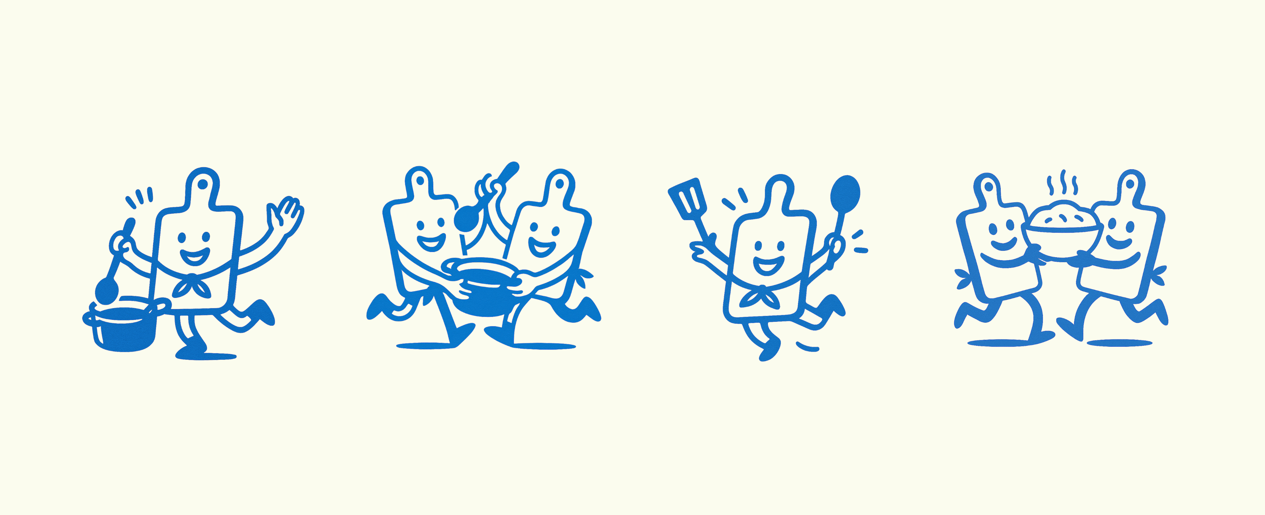
Rather than redesigning a few standalone graphics, I built a reusable branding system. The refreshed direction combines bold typographic hierarchy, cheerful colour blocking, and a friendly mascot-style illustration language. I defined key rules and components—including logo lockups, colour palette, illustration/icon style, pattern rules, and spacing/grid guidance—so the brand can scale confidently while staying playful, clear, and commercially usable.
Deliverables & Applications
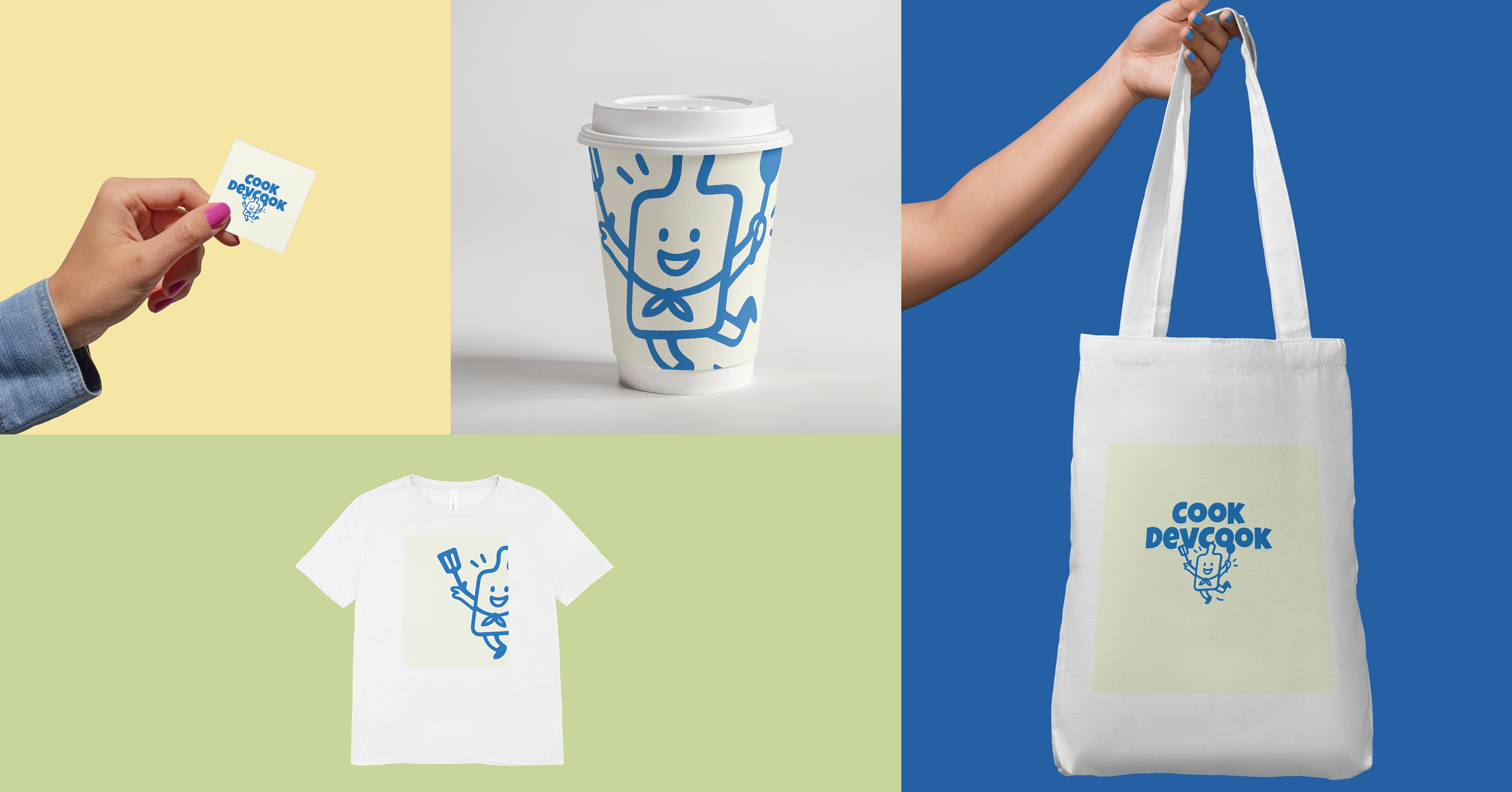
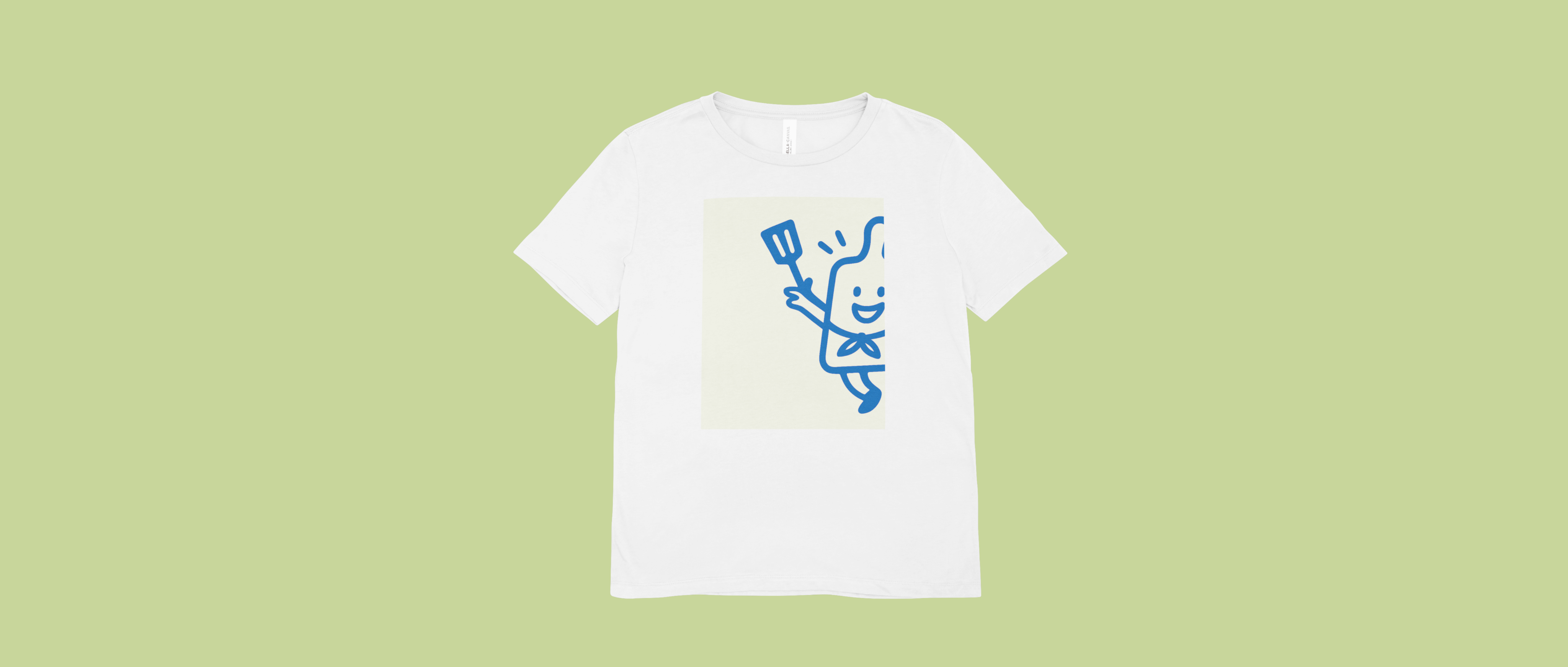
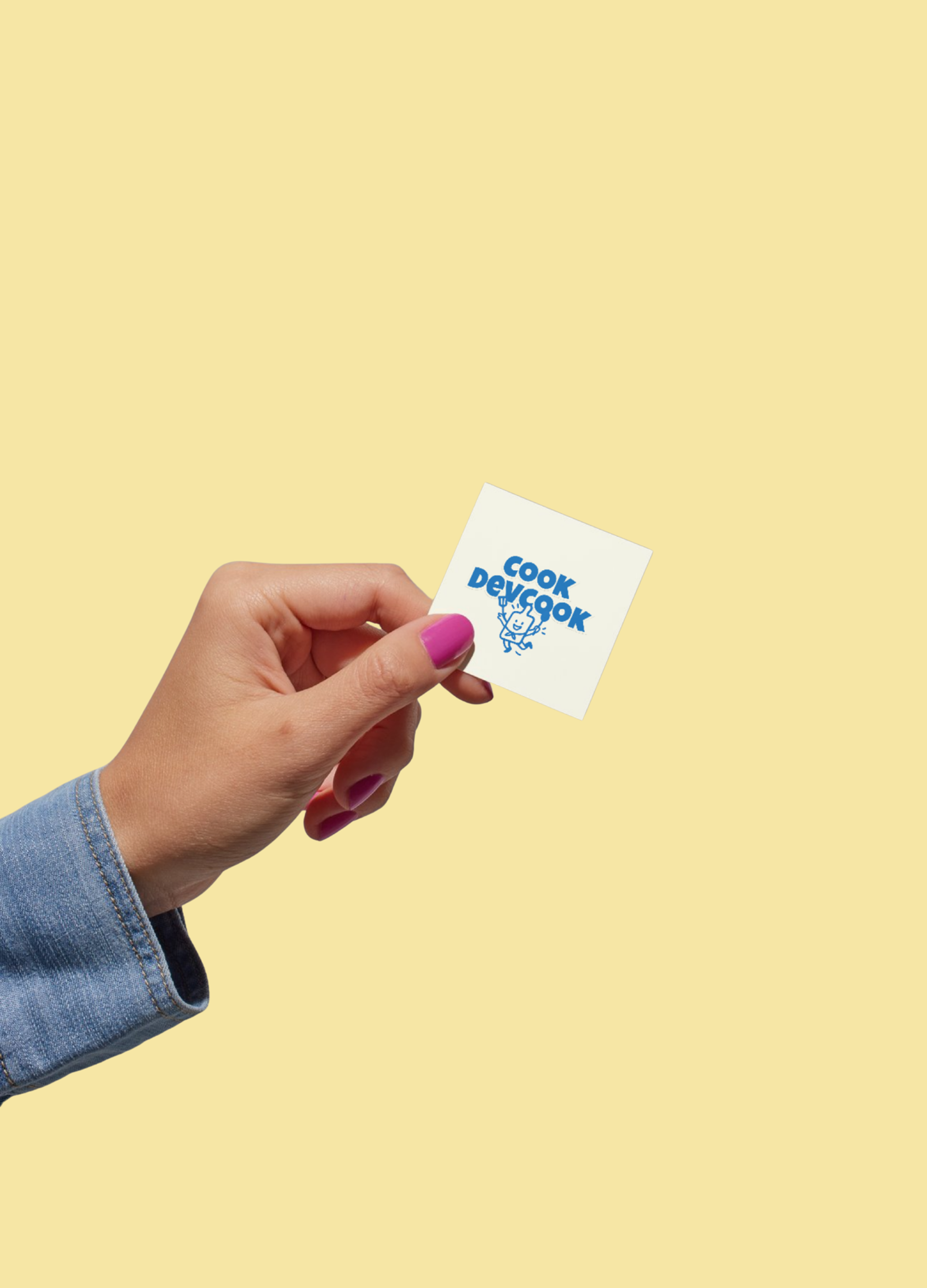
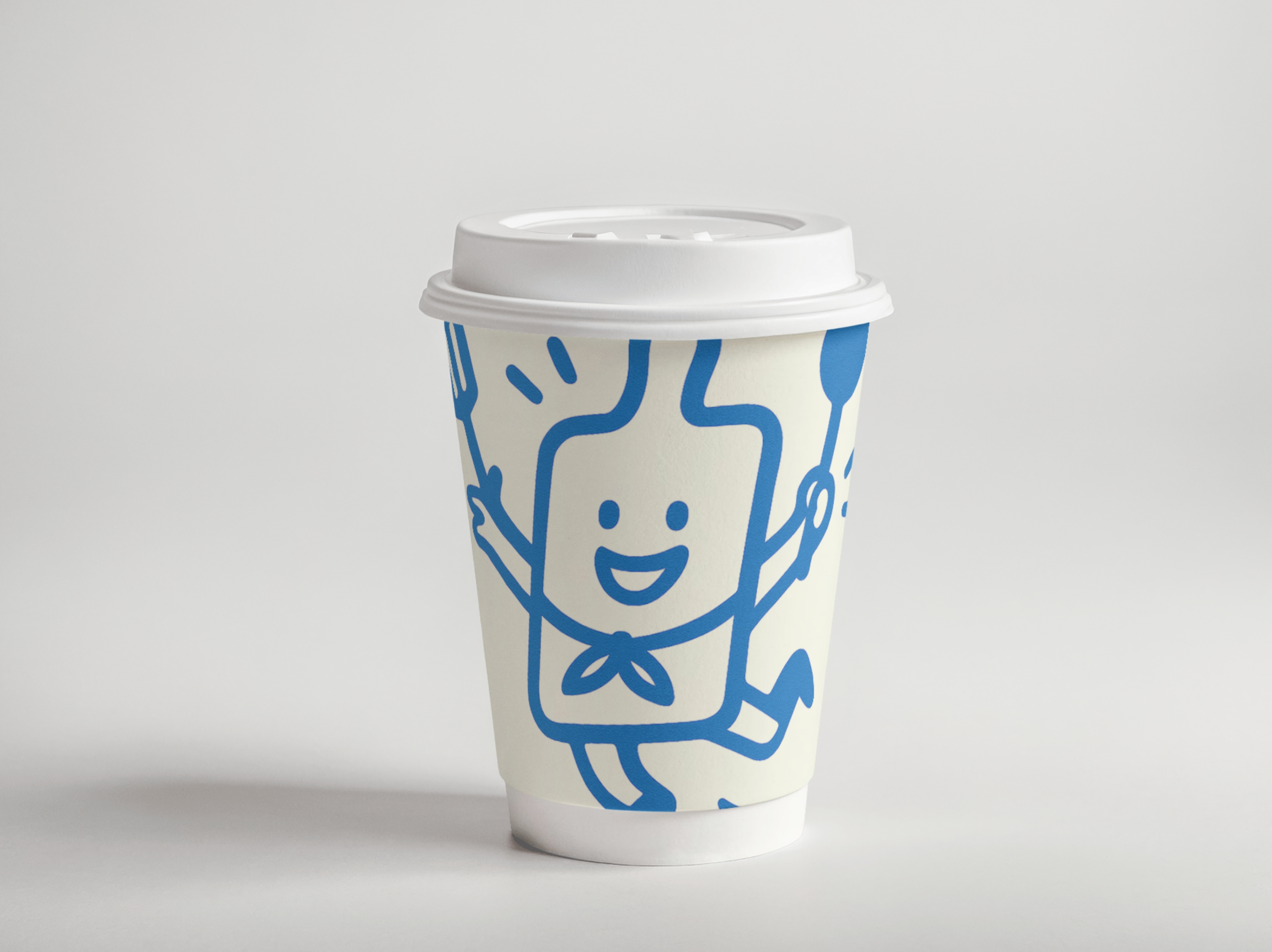
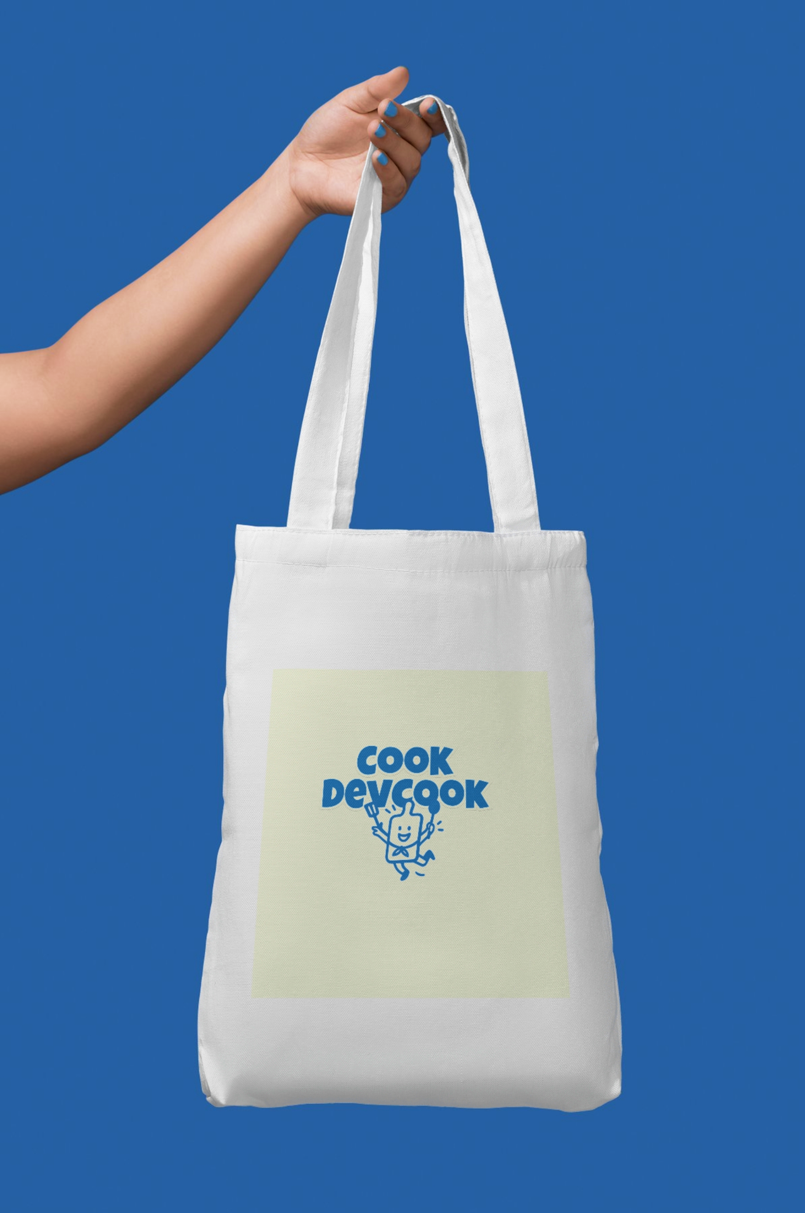
I produced a cohesive set of assets and applications, including key visuals, pattern explorations, and mockups across both digital and print touchpoints—such as social posts / banner ads and physical brand applications like posters and tote-bag merchandise—ensuring the identity remains consistent, fun, memorable, and shareable across channels.


Visual Rebrand & Advertising Redesign
— CookDevcook
I redesigned CookDevcook’s branding visuals and ad creatives to build a more playful, childlike, and approachable identity. The refreshed direction uses bold typography, cheerful colour blocking, and a friendly mascot-style illustration system to strengthen brand recognition and create a light, energetic tone across campaign assets. I developed a cohesive set of brand applications—including key visuals, pattern explorations, and mockups—ensuring consistency across both digital and print touchpoints while making the brand feel more fun, memorable, and shareable.
Goal & Problem
CookDevcook’s existing visuals lacked a consistent, instantly recognisable identity across ads, and the overall tone felt less engaging for a younger, more social-first audience. My goal was to improve brand consistency, strengthen first-glance recognition, and make campaign creatives more eye-catching and readable in fast-scrolling environments.
Design Approach
Rather than redesigning a few standalone graphics, I built a reusable branding system. The refreshed direction combines bold typographic hierarchy, cheerful colour blocking, and a friendly mascot-style illustration language. I defined key rules and components—including logo lockups, colour palette, illustration/icon style, pattern rules, and spacing/grid guidance—so the brand can scale confidently while staying playful, clear, and commercially usable.
Deliverables & Applications
I produced a cohesive set of assets and applications, including key visuals, pattern explorations, and mockups across both digital and print touchpoints—such as social posts / banner ads and physical brand applications like posters and tote-bag merchandise—ensuring the identity remains consistent, fun, memorable, and shareable across channels.
“More playful. More memorable.
More CookDevcook.”
Cassie Chen
Visual Rebrand & Advertising Redesign
— CookDevcook
I redesigned CookDevcook’s branding visuals and ad creatives to build a more playful, childlike, and approachable identity. The refreshed direction uses bold typography, cheerful colour blocking, and a friendly mascot-style illustration system to strengthen brand recognition and create a light, energetic tone across campaign assets. I developed a cohesive set of brand applications—including key visuals, pattern explorations, and mockups—ensuring consistency across both digital and print touchpoints while making the brand feel more fun, memorable, and shareable.
Goal & Problem
CookDevcook’s existing visuals lacked a consistent, instantly recognisable identity across ads, and the overall tone felt less engaging for a younger, more social-first audience. My goal was to improve brand consistency, strengthen first-glance recognition, and make campaign creatives more eye-catching and readable in fast-scrolling environments.
Design Approach
Rather than redesigning a few standalone graphics, I built a reusable branding system. The refreshed direction combines bold typographic hierarchy, cheerful colour blocking, and a friendly mascot-style illustration language. I defined key rules and components—including logo lockups, colour palette, illustration/icon style, pattern rules, and spacing/grid guidance—so the brand can scale confidently while staying playful, clear, and commercially usable.
Deliverables & Applications
I produced a cohesive set of assets and applications, including key visuals, pattern explorations, and mockups across both digital and print touchpoints—such as social posts / banner ads and physical brand applications like posters and tote-bag merchandise—ensuring the identity remains consistent, fun, memorable, and shareable across channels.