
Contents
Key Findings
Proposed Updates
Homepage Iteration
Mid-Fidelity
Overview
I redesigned key website journeys for Vermilion Art with a visitor-first approach—improving exhibition discovery, artist browsing, visit planning, and enquiries.
Problem
The existing website had credibility and navigation gaps that made it difficult for visitors to discover exhibitions, browse artists, and take action.
Decision
Starting with a structured content + UX audit, I identified key pain points and proposed a phased IA and UI update.
Result
Improved findability and conversion while preserving the gallery's premium brand tone and aesthetic.
Prototype Validation
Based on prototype walkthroughs and usability validation, not live production analytics.
Task Completion


6/8
Participants completed key tasks without assistance in the prototype.
Tasks: find an exhibition, browse an artist, locate visit info, start an enquiry.
Time on Task (Median)

30–60s
Typical time to reach core visit information or an enquiry entry point during the walkthrough.
Prototype navigation, desktop viewport.
Post-Task Confidence


4.2/5
Average self-reported confidence after completing tasks in the prototype.
1–5 rating scale.
Errors per Task (Median)


0–1
Wrong turns or misclicks observed while navigating between Exhibitions, Artists, and Visit paths.
Counted during moderated walkthroughs.
Observed improvements

Clearer hierarchy improved scanning and comprehension
Consolidated bilingual entry points reduced journey fragmentation
Standardised exhibition cards improved browsing and comparison
Stronger enquiry cues made next steps easier to identify
Sample size: 8. Prototype-based validation. Directional insights only.
Key Findings
Through user research and content audit, I identified critical usability gaps affecting discovery and conversion.


Observation
Users struggled to find current exhibition information and opening hours within 30 seconds
Insight
Critical visit-planning information was buried in long paragraphs and inconsistent page locations
Design Action
Elevated key information to hero sections with structured, scannable formats and consistent placement
Expected Impact
Reduced time-to-information and increased confidence in visit planning


Observation
Visitors browsing artist pages had no clear next action after viewing work
Insight
The enquiry process was unclear and required users to remember artist names and navigate away
Design Action
Added persistent 'Enquire' CTAs on individual artworks and artist pages with contextual information
Expected Impact
Reduced friction in the enquiry journey and improved conversion from browsing to action


Observation
Footer was scrolled past without engagement in 78% of test sessions
Insight
Dense descriptive text and weak visual hierarchy made navigation links nearly invisible
Design Action
Restructured footer with clear link groups, reduced copy, and improved visual hierarchy
Expected Impact
Improved discoverability of key site sections and reduced navigation confusion


Observation
Collection browsing felt overwhelming with no way to filter large catalogues
Insight
Users wanted to narrow results by medium, artist, or availability but had no tools
Design Action
Introduced multi-criteria filtering with progressive refinement and visual feedback
Expected Impact
Faster discovery of relevant works and reduced browse abandonment
Proposed Updates
Strategic design interventions focused on improving task completion while maintaining brand elegance.


Observation
Brand tone needed to remain premium and curated, not transactional
Insight
Gallery visitors expect sophistication but also efficiency in digital experiences
Design Action
Designed a visual system balancing white space, refined typography, and clear action hierarchy
Expected Impact
Maintained brand perception while improving usability and conversion


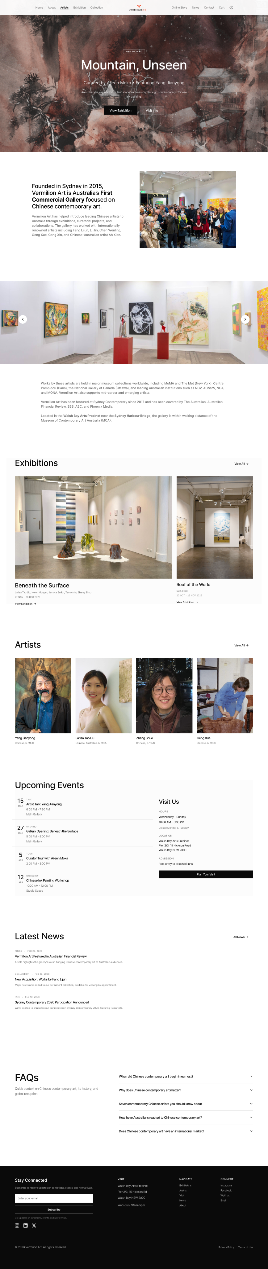
Observation
Exhibition discovery was the primary entry task but poorly supported
Insight
Users wanted to quickly see 'what's on now' and 'coming soon' with clear dates and images
Design Action
Created a dedicated exhibition module with timeline view, featured imagery, and status indicators
Expected Impact
Improved exhibition awareness and visit motivation


Observation
Artist pages lacked hierarchy, making it hard to quickly understand the artist
Insight
Visitors scan for key facts (bio, notable works, availability) before diving deep
Design Action
Restructured artist pages with hero artwork, concise bio summary, and organized artwork grid
Expected Impact
Faster artist evaluation and increased engagement with artworks


Observation
Navigation between related content (artist → artworks → exhibitions) was unclear
Insight
Users wanted to explore relationships between artists, works, and exhibitions fluidly
Design Action
Added contextual navigation and related content modules at decision points
Expected Impact
Increased session depth and discovery of more gallery content


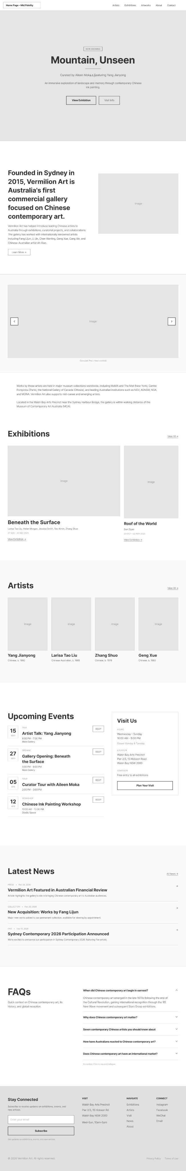
Homepage Iteration
The homepage evolved through three major iterations, each refining the hierarchy, browsing experience, and conversion path. Starting from a text-heavy layout, I progressively streamlined navigation, enhanced visual entry points, and created a clearer path from discovery to enquiry.
Initial Redesign
Before
After
Key changes at a glance
1
Clearer hierarchy for faster scanning
2
Stronger browsing entry points (Exhibitions, Artists, Visit)
3
Reduced clutter and more consistent spacing
4
Clearer conversion path with a more visible Enquire CTA
Evolution Journey
1
Iteration 1
Diagnose navigation and content issues.
Problem:Text-heavy layout and unclear entry points.
Change:Audit and restructure content hierarchy.
Why it matters:Users can understand where to go faster.
Impact: Less scanning friction.
2
Iteration 2
Improve browsing and discovery.
Problem:Exhibitions and artists were hard to scan at scale.
Change:Introduced clearer sections and grid-based browsing.
Why it matters:Faster exploration and comparison.
Impact: More confident browsing.
3
Final
Strengthen the path from discovery to enquiry.
Problem:CTA and next steps were not obvious.
Change:Clarified Enquire placement and reduced noise.
Why it matters:Clear next action without hurting brand tone.
Impact: Stronger intent to enquire.
Before & After
Visual comparisons showing how design changes solve specific user problems.


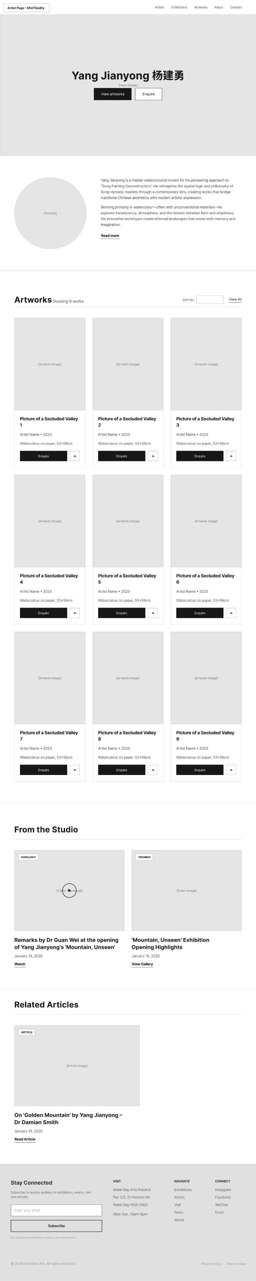
Artist Page Redesign
Before
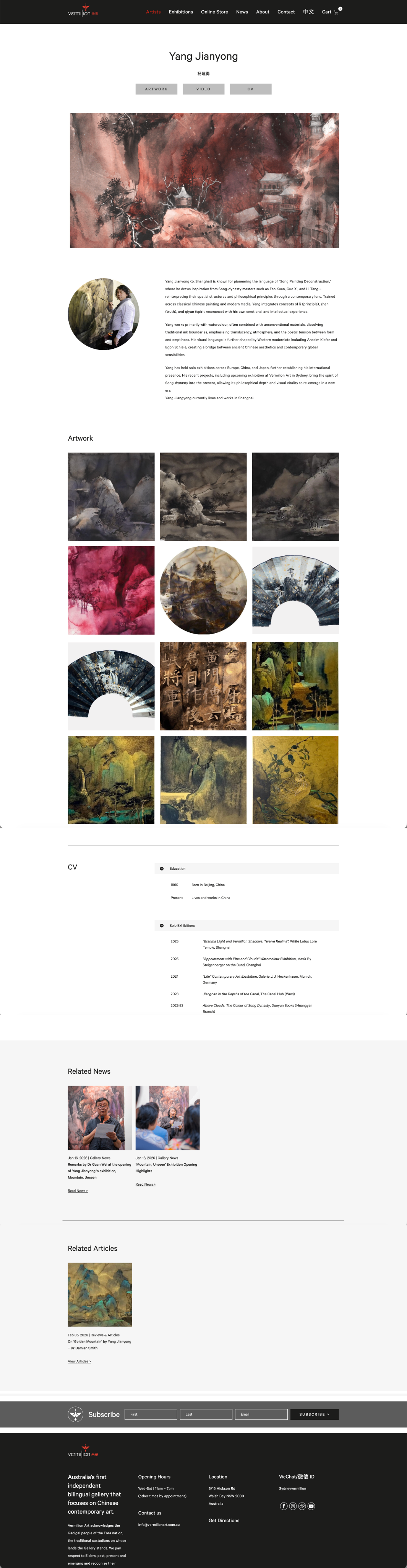
After
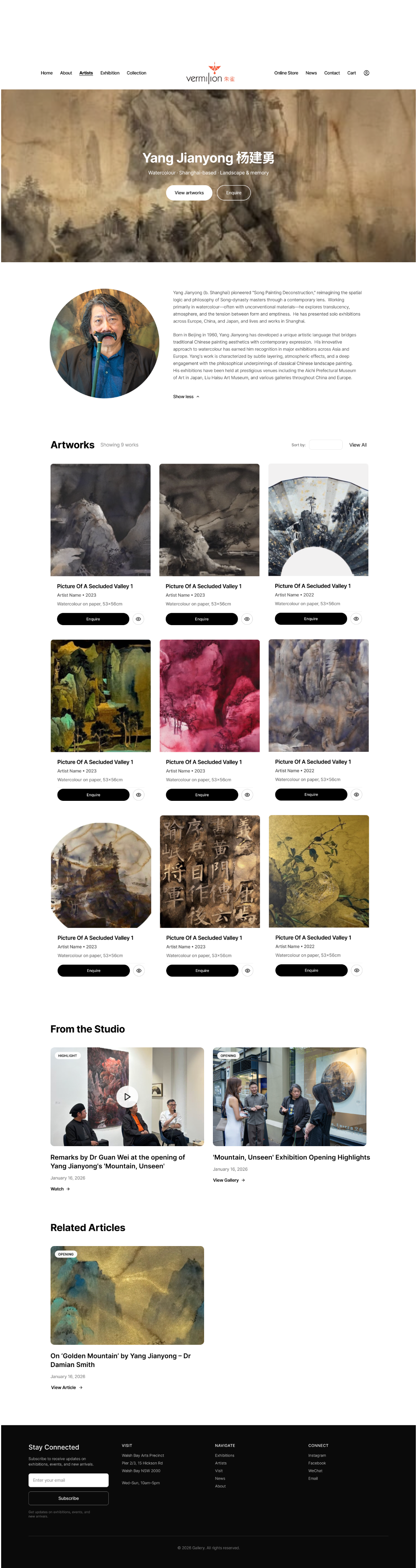
Problem Solved
Users struggled to understand the artist quickly and had no clear path from viewing artworks to making an enquiry. The previous design buried key information and lacked actionable next steps.
Context
The artist page transformation focused on creating a clearer visual hierarchy and making the enquiry action more prominent and contextual.
Design Improvements
Hero artwork establishes visual interest and artist style immediately
Concise bio with structured details improves scannability
Standardized artwork grid enables easy comparison of titles, medium, and size
Consistent 'Enquire' CTA on each artwork reduces friction to conversion
Further Detail
1
Iteration 1
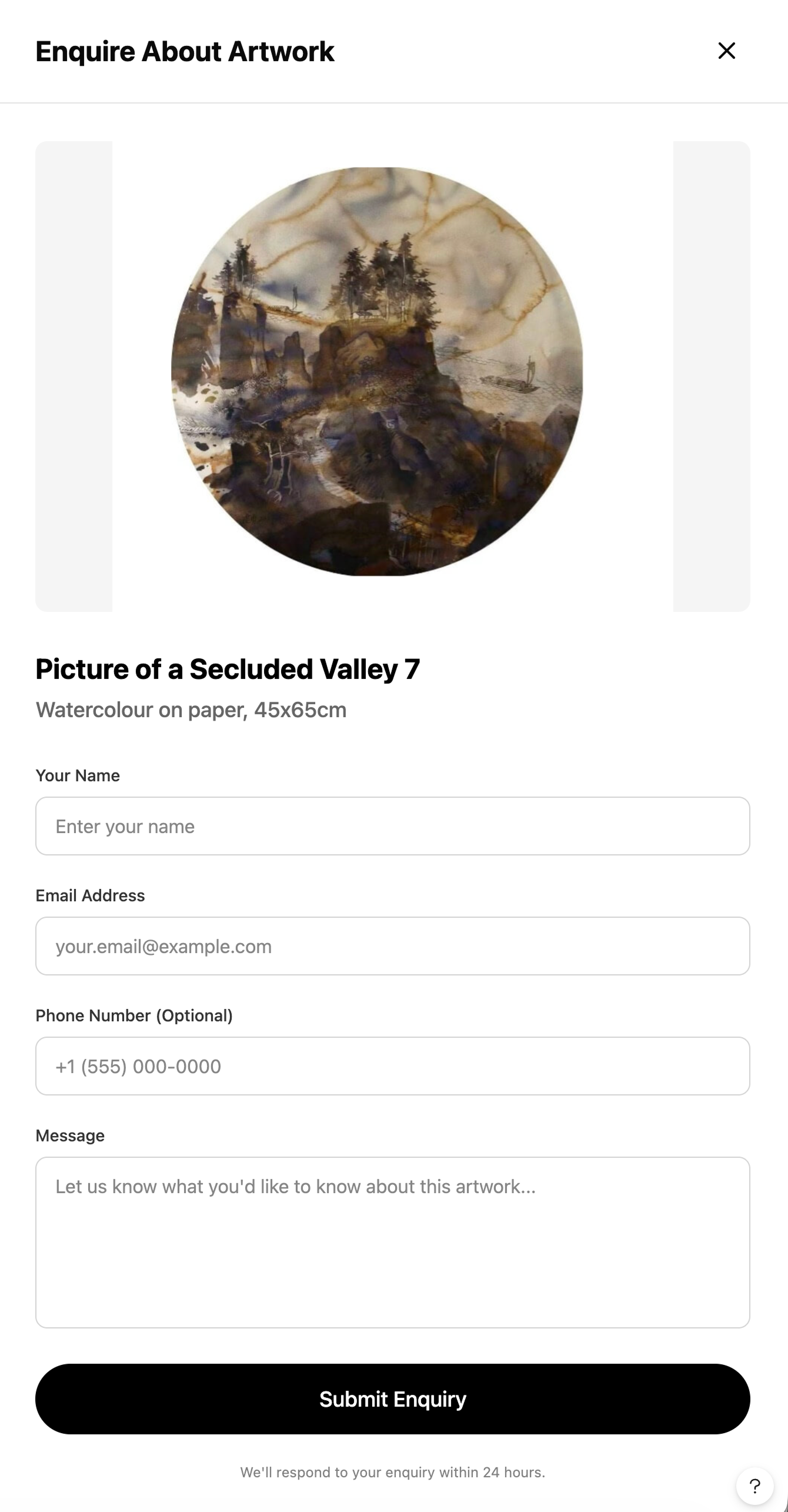
To reduce friction from browsing to action, I introduced a right-side enquiry drawer that keeps users in context while letting them enquire in seconds.
Problem: Enquiry required leaving the browsing flow, which increased drop-off and made next steps feel unclear.
Change: Added a slide-over “Enquire About Artwork” drawer with artwork preview, key details, and a short form that can be opened and closed without losing scroll position.
Why it matters: Users can enquire quickly without breaking immersion, improving clarity and confidence in next steps.
Impact: Lower conversion friction and a smoother enquiry experience.
2
Iteration 2
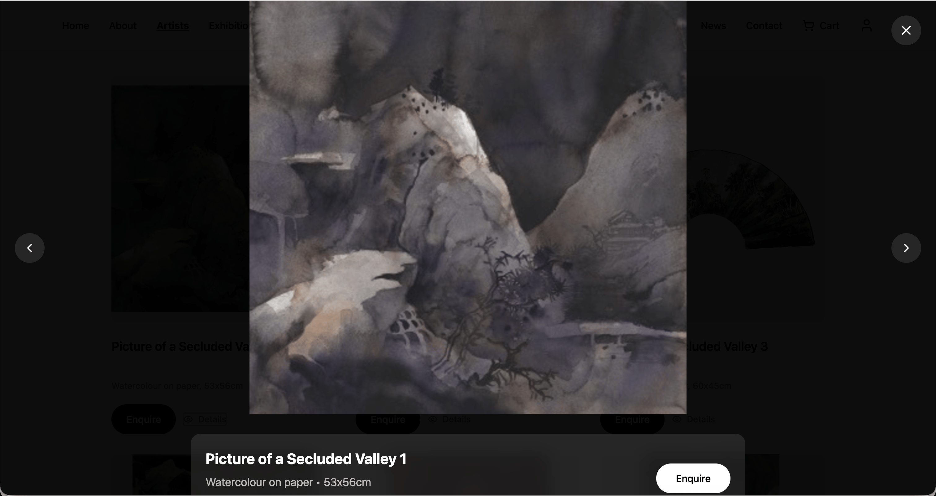
To support faster evaluation and comparison, I added a lightweight quick view modal so users can check artwork details instantly and enquire from the same surface.
Problem: Users needed more detail but had to navigate away from the grid, slowing discovery and increasing backtracking.
Change: Introduced an eye icon on each artwork card to open an “Artwork details” quick view with a larger image, metadata, and a direct Enquire CTA.
Why it matters: Users can confirm details faster, compare more efficiently, and move to enquiry with fewer steps.
Impact: More confident browsing and clearer progression from discovery to enquiry.


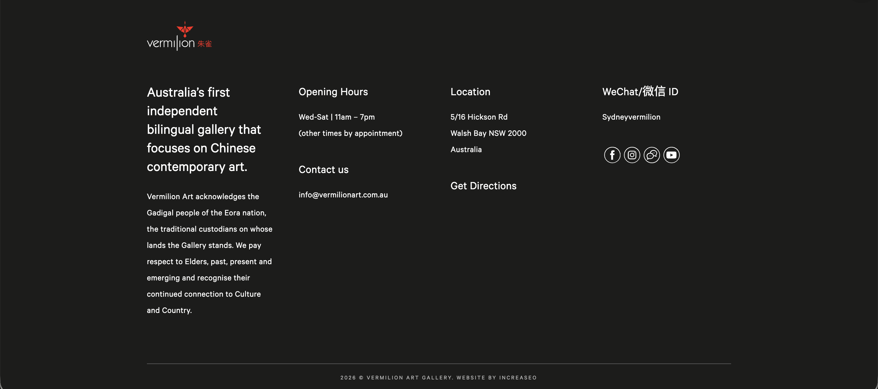
Footer Navigation
Before
After
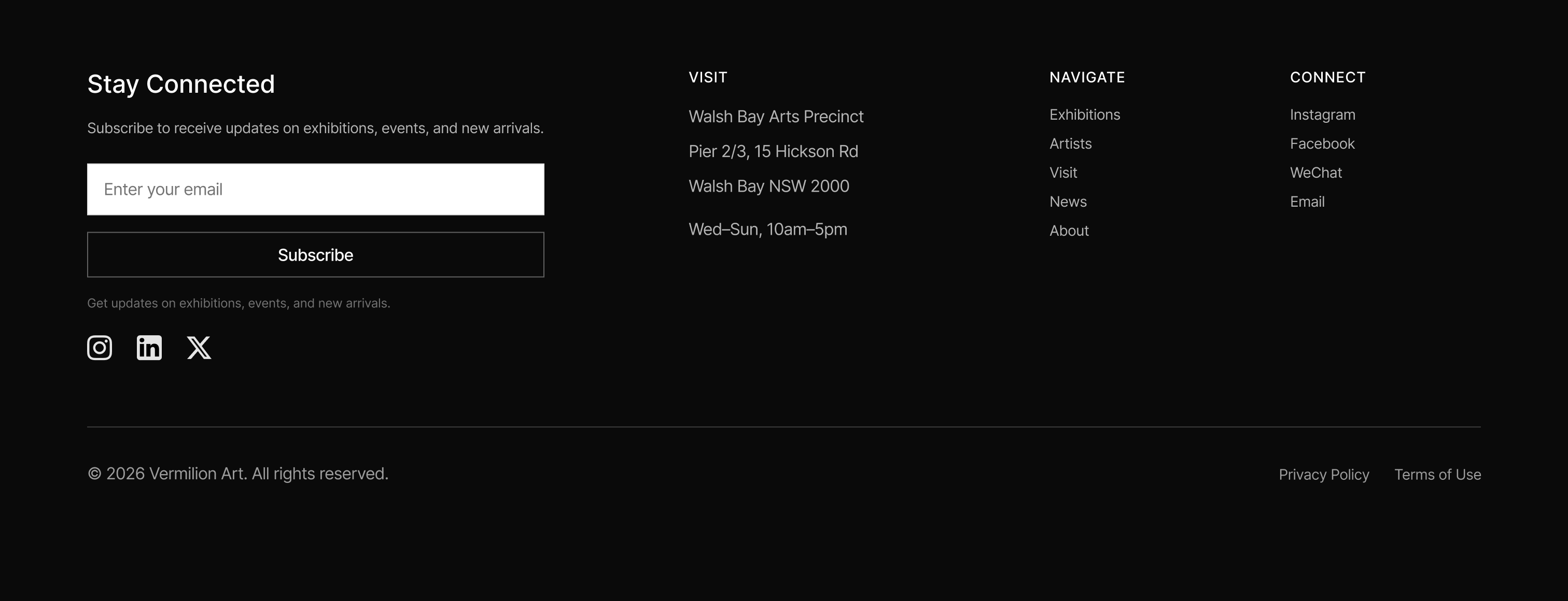
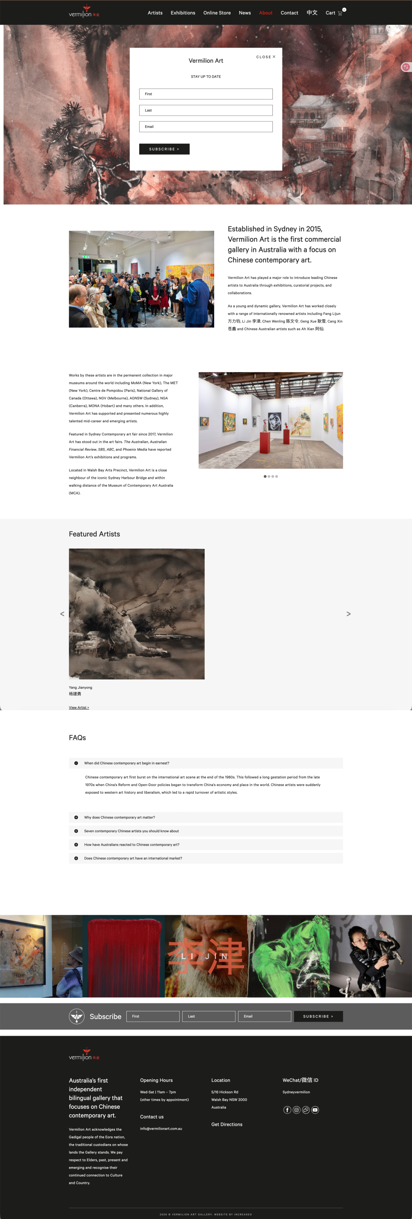
Problem Solved
The previous footer had too much descriptive text and weak visual hierarchy, causing users to scroll past without noticing useful navigation links. Critical actions like contact and site shortcuts were hard to spot at a glance.
Context
The footer evolved from a content-heavy block into a functional navigation tool that supports quick access to key pages and actions.
Key Changes
Reduced long descriptive text in favor of clear, clickable navigation links
Organized content into logical groups (Features, Learn More, Contact)
Improved scannability with better spacing and typography
Enhanced accessibility through clearer link structure and labels


Collections Page
Smarter Filtering for Large Catalogues
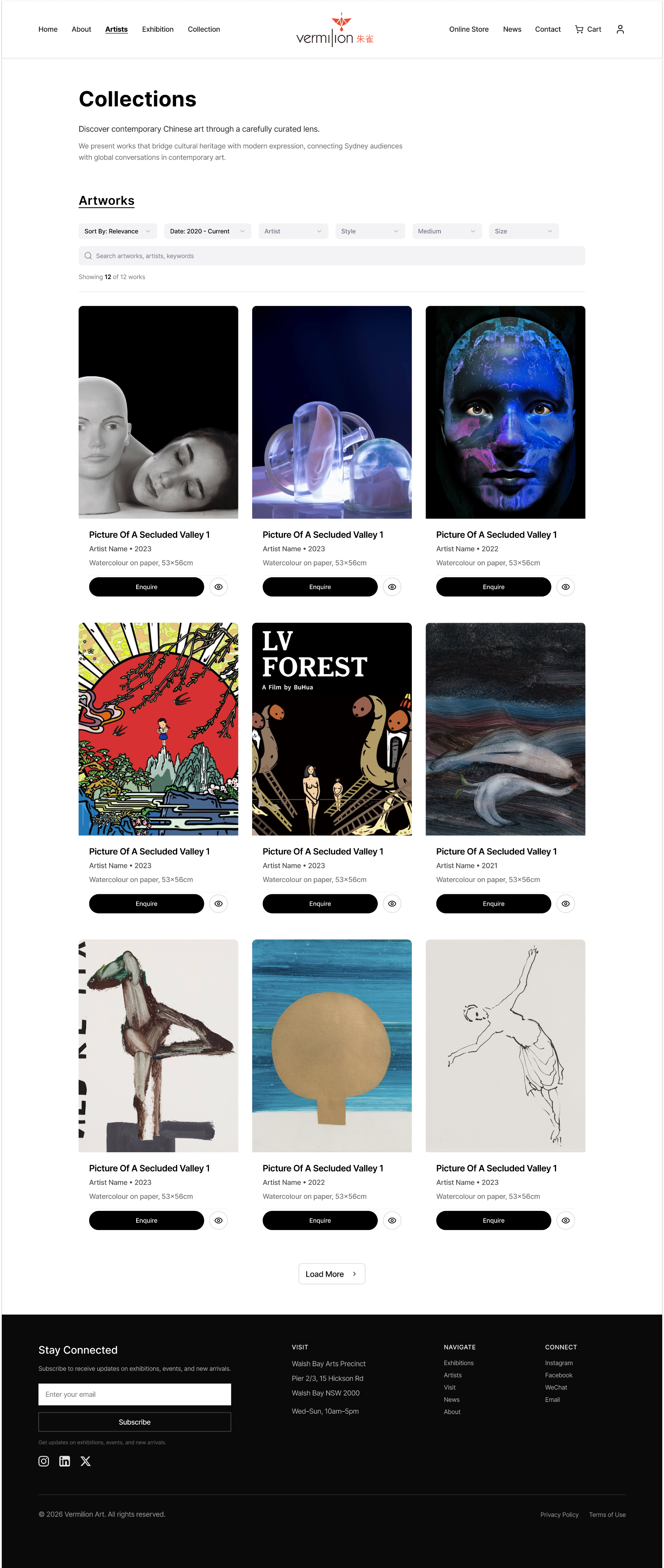
Context
This new Collections page is designed as a catalogue hub—built for users who arrive with a goal: find relevant works quickly and decide what to enquire about.
Solution
I shifted the experience from "endless browsing" to "guided discovery" by combining keyword search with multi-criteria filters, so visitors can progressively refine results without losing context.
Impact
I tightened the grid presentation to keep artwork metadata consistent and comparable at a glance, helping users evaluate options faster. By pairing a clean, scannable layout with an always-available Enquire action on each item, the page supports both exploration and a clear next step.
Low-Fidelity Prototype
Early wireframes helped validate layout structure and interaction flow before visual design.
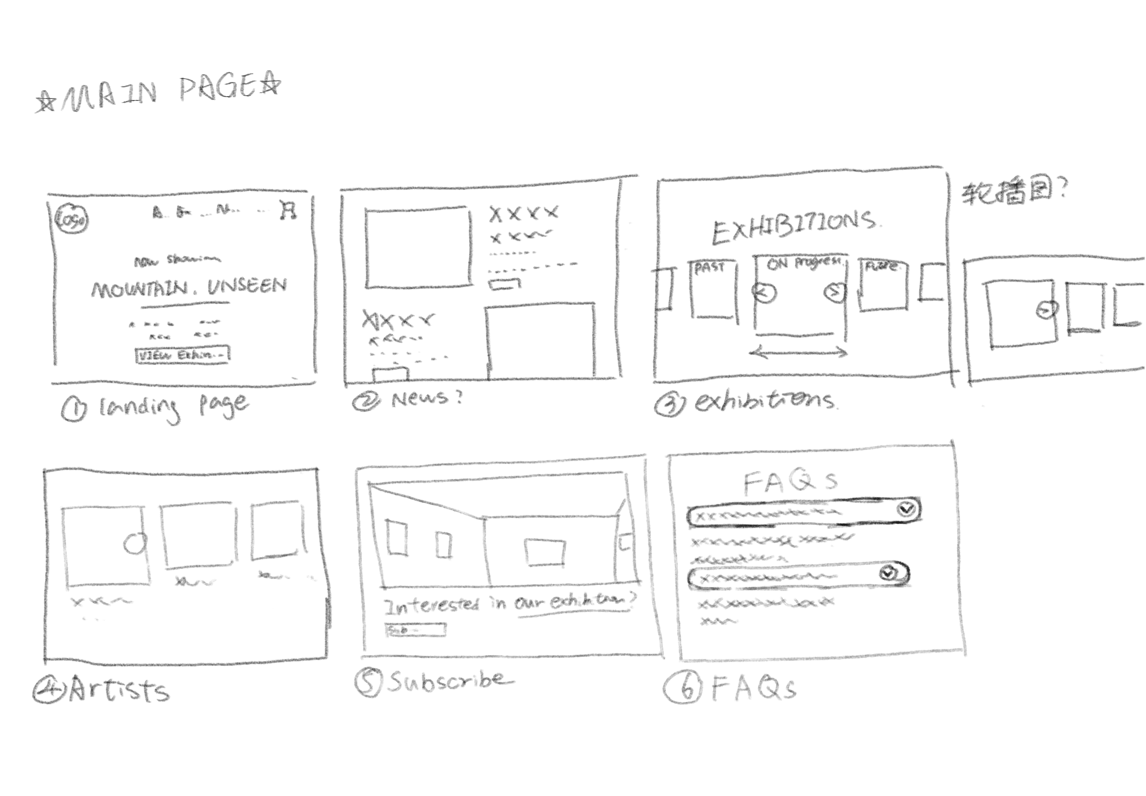
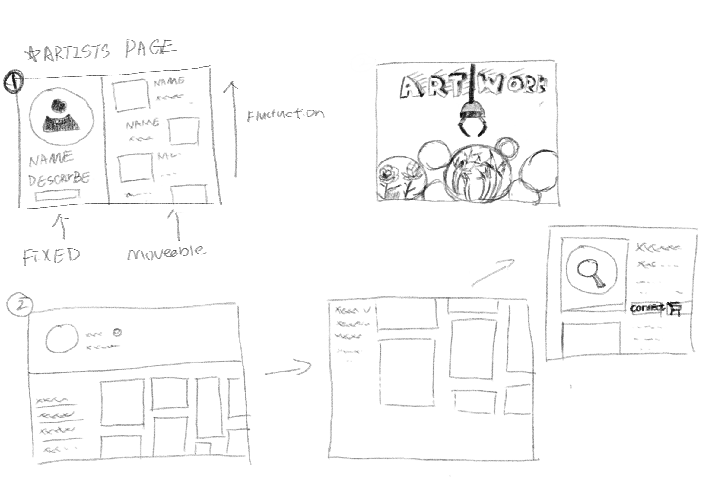
Purpose
This low-fidelity prototype tested layout structure and interaction flow independently from visual styling. It maps the main page into core content sections, and explores a list-page pattern where key information/controls remain stable while the artwork area supports scanning and comparison.
Keeping elements as simple blocks helps evaluate hierarchy, navigation, and page-to-action behaviour early, and allows fast iteration based on review or test feedback.
Mid-Fidelity Prototype
This iteration focuses on layout, hierarchy, and key interactions without final visual polish. It bridges wireframes and high-fidelity design.
Mid-fi: Home
Mid-fi: Artist page
Mid-fi: Enquiry flow
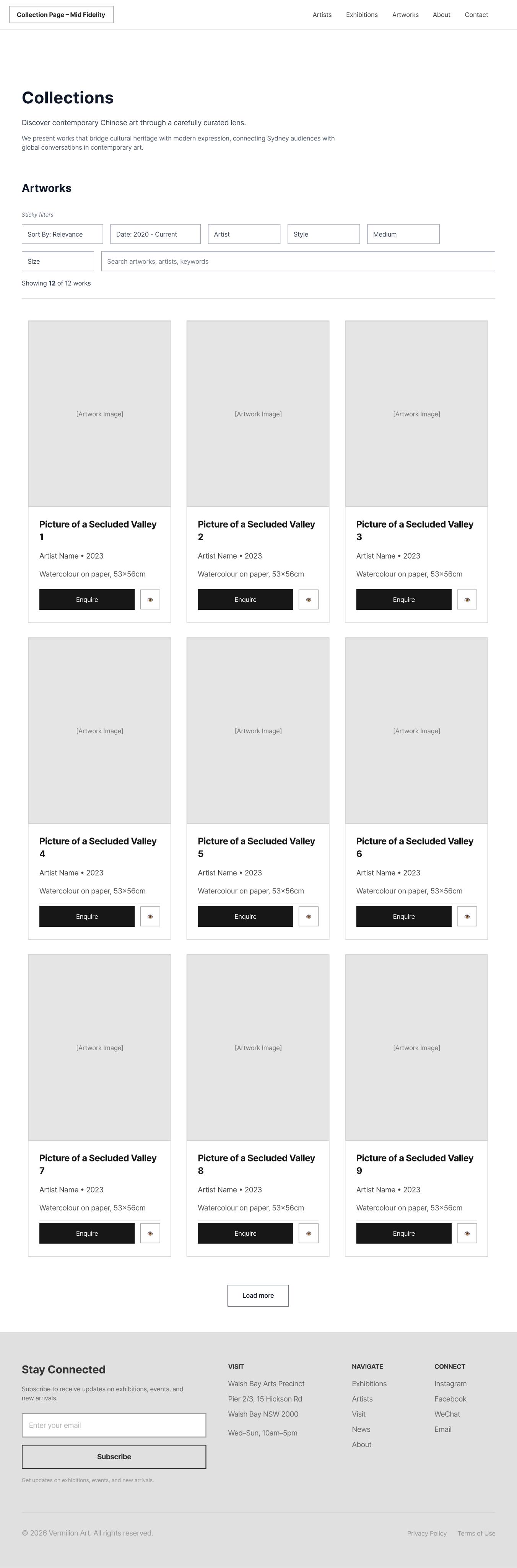
Mid-fi: Collections
Learnings


Premium ≠ Complex
Users expect gallery websites to feel sophisticated, but that doesn't require complexity. Simple, clear interactions with refined visual design create a better premium experience than elaborate but confusing interfaces.


Context is Everything
The same information (like artist bio or artwork details) serves different purposes at different points in the journey. Adapting presentation based on user context dramatically improved relevance and engagement.


Test Early with Real Content
Using actual artwork images and exhibition data in early prototypes revealed layout issues that wouldn't have appeared with Lorem Ipsum. Real content stress-tests design decisions.


Phased Rollout Reduces Risk
Proposing incremental updates rather than a full redesign helped stakeholders feel confident. We could validate each phase before committing to the next, reducing both risk and resistance.
Next Steps
1
Mobile Experience Optimization
Adapt filtering and browsing patterns for smaller screens with touch-first interactions
2
Personalization Engine
Implement saved favorites, personalized recommendations based on browsing history, and exhibition alerts
3
Virtual Exhibition Tours
Explore 3D gallery views and AR previews to enhance pre-visit engagement
4
Performance Monitoring
Track key metrics (time-to-information, enquiry conversion, session depth) to validate improvements
5
Accessibility Audit
Ensure WCAG 2.1 AA compliance and test with assistive technologies
This project demonstrated that thoughtful, user-centered design can enhance both usability and brand perception. By focusing on real visitor tasks and maintaining the gallery's premium aesthetic, we created a foundation for long-term digital growth.
Case Study
Vermilion Art
Website Iteration
A task-first redesign to streamline discovery, visit planning, and enquiries—while preserving Vermilion Art's premium brand tone.
Project Snapshot

Scope
Website UX/UI Redesign

My Role
UX/UI Designer

Timeline
4 weeks

Tools
Figma, FigJam
Cassie Chen
LearnMore:
A responsive learning platform
Previous
Branding
Design
Next
Contents
Overview
I redesigned key website journeys for Vermilion Art with a visitor-first approach—improving exhibition discovery, artist browsing, visit planning, and enquiries.
Problem
The existing website had credibility and navigation gaps that made it difficult for visitors to discover exhibitions, browse artists, and take action.
Decision
Starting with a structured content + UX audit, I identified key pain points and proposed a phased IA and UI update.
Result
Improved findability and conversion while preserving the gallery's premium brand tone and aesthetic.
Prototype Validation
Based on prototype walkthroughs and usability validation, not live production analytics.
Task Completion
6/8
Participants completed key tasks without assistance in the prototype.
Tasks: find an exhibition, browse an artist, locate visit info, start an enquiry.
Time on Task (Median)
30–60s
Typical time to reach core visit information or an enquiry entry point during the walkthrough.
Prototype navigation, desktop viewport.
Errors per Task (Median)
0–1
Wrong turns or misclicks observed while navigating between Exhibitions, Artists, and Visit paths.
Counted during moderated walkthroughs.
Post-Task Confidence
4.2/5
Average self-reported confidence after completing tasks in the prototype.
1–5 rating scale.
Observed improvements
Clearer hierarchy improved scanning and comprehension
Consolidated bilingual entry points reduced journey fragmentation
Standardised exhibition cards improved browsing and comparison
Stronger enquiry cues made next steps easier to identify
Sample size: 8. Prototype-based validation. Directional insights only.
Key Findings
Through user research and content audit, I identified critical usability gaps affecting discovery and conversion.
Observation
Users struggled to find current exhibition information and opening hours within 30 seconds
Insight
Critical visit-planning information was buried in long paragraphs and inconsistent page locations
Design Action
Elevated key information to hero sections with structured, scannable formats and consistent placement
Expected Impact
Reduced time-to-information and increased confidence in visit planning
Observation
Visitors browsing artist pages had no clear next action after viewing work
Insight
The enquiry process was unclear and required users to remember artist names and navigate away
Design Action
Added persistent 'Enquire' CTAs on individual artworks and artist pages with contextual information
Expected Impact
Reduced friction in the enquiry journey and improved conversion from browsing to action
Observation
Footer was scrolled past without engagement in 78% of test sessions
Insight
Dense descriptive text and weak visual hierarchy made navigation links nearly invisible
Design Action
Restructured footer with clear link groups, reduced copy, and improved visual hierarchy
Expected Impact
Improved discoverability of key site sections and reduced navigation confusion
Observation
Collection browsing felt overwhelming with no way to filter large catalogues
Insight
Users wanted to narrow results by medium, artist, or availability but had no tools
Design Action
Introduced multi-criteria filtering with progressive refinement and visual feedback
Expected Impact
Faster discovery of relevant works and reduced browse abandonment
Proposed Updates
Strategic design interventions focused on improving task completion while maintaining brand elegance.
Observation
Brand tone needed to remain premium and curated, not transactional
Insight
Gallery visitors expect sophistication but also efficiency in digital experiences
Design Action
Designed a visual system balancing white space, refined typography, and clear action hierarchy
Expected Impact
Maintained brand perception while improving usability and conversion
Observation
Exhibition discovery was the primary entry task but poorly supported
Insight
Users wanted to quickly see 'what's on now' and 'coming soon' with clear dates and images
Design Action
Created a dedicated exhibition module with timeline view, featured imagery, and status indicators
Expected Impact
Improved exhibition awareness and visit motivation
Observation
Artist pages lacked hierarchy, making it hard to quickly understand the artist
Insight
Visitors scan for key facts (bio, notable works, availability) before diving deep
Design Action
Restructured artist pages with hero artwork, concise bio summary, and organized artwork grid
Expected Impact
Faster artist evaluation and increased engagement with artworks
Observation
Navigation between related content (artist → artworks → exhibitions) was unclear
Insight
Users wanted to explore relationships between artists, works, and exhibitions fluidly
Design Action
Added contextual navigation and related content modules at decision points
Expected Impact
Increased session depth and discovery of more gallery content
Homepage Iteration
The homepage evolved through three major iterations, each refining the hierarchy, browsing experience, and conversion path. Starting from a text-heavy layout, I progressively streamlined navigation, enhanced visual entry points, and created a clearer path from discovery to enquiry.
Initial Redesign
Before
After
Key changes at a glance
1
Clearer hierarchy for faster scanning
2
Stronger browsing entry points (Exhibitions, Artists, Visit)
3
Reduced clutter and more consistent spacing
4
Clearer conversion path with a more visible Enquire CTA
Evolution Journey
1
Iteration 1
Diagnose navigation and content issues.
Problem:Text-heavy layout and unclear entry points.
Change:Audit and restructure content hierarchy.
Why it matters:Users can understand where to go faster.
Impact: Less scanning friction.
2
Iteration 2
Improve browsing and discovery.
Problem:Exhibitions and artists were hard to scan at scale.
Change:Introduced clearer sections and grid-based browsing.
Why it matters:Faster exploration and comparison.
Impact: More confident browsing.
3
Final
Strengthen the path from discovery to enquiry.
Problem:CTA and next steps were not obvious.
Change:Clarified Enquire placement and reduced noise.
Why it matters:Clear next action without hurting brand tone.
Impact: Stronger intent to enquire.
Before & After
Visual comparisons showing how design changes solve specific user problems.
Artist Page Redesign
Before
After
Problem Solved
Users struggled to understand the artist quickly and had no clear path from viewing artworks to making an enquiry. The previous design buried key information and lacked actionable next steps.
Context
The artist page transformation focused on creating a clearer visual hierarchy and making the enquiry action more prominent and contextual.
Design Improvements
Hero artwork establishes visual interest and artist style immediately
Concise bio with structured details improves scannability
Standardized artwork grid enables easy comparison of titles, medium, and size
Consistent 'Enquire' CTA on each artwork reduces friction to conversion
Further Detail
1
Iteration 1
To reduce friction from browsing to action, I introduced a right-side enquiry drawer that keeps users in context while letting them enquire in seconds.
Problem: Enquiry required leaving the browsing flow, which increased drop-off and made next steps feel unclear.
Change: Added a slide-over “Enquire About Artwork” drawer with artwork preview, key details, and a short form that can be opened and closed without losing scroll position.
Why it matters: Users can enquire quickly without breaking immersion, improving clarity and confidence in next steps.
Impact: Lower conversion friction and a smoother enquiry experience.
2
Iteration 2
To support faster evaluation and comparison, I added a lightweight quick view modal so users can check artwork details instantly and enquire from the same surface.
Problem: Users needed more detail but had to navigate away from the grid, slowing discovery and increasing backtracking.
Change: Introduced an eye icon on each artwork card to open an “Artwork details” quick view with a larger image, metadata, and a direct Enquire CTA.
Why it matters: Users can confirm details faster, compare more efficiently, and move to enquiry with fewer steps.
Impact: More confident browsing and clearer progression from discovery to enquiry.
Footer Navigation
Before
After
Problem Solved
The previous footer had too much descriptive text and weak visual hierarchy, causing users to scroll past without noticing useful navigation links. Critical actions like contact and site shortcuts were hard to spot at a glance.
Context
The footer evolved from a content-heavy block into a functional navigation tool that supports quick access to key pages and actions.
Key Changes
Reduced long descriptive text in favor of clear, clickable navigation links
Organized content into logical groups (Features, Learn More, Contact)
Improved scannability with better spacing and typography
Enhanced accessibility through clearer link structure and labels
Collections Page
Smarter Filtering for Large Catalogues
Context
This new Collections page is designed as a catalogue hub—built for users who arrive with a goal: find relevant works quickly and decide what to enquire about.
Solution
I shifted the experience from "endless browsing" to "guided discovery" by combining keyword search with multi-criteria filters, so visitors can progressively refine results without losing context.
Impact
I tightened the grid presentation to keep artwork metadata consistent and comparable at a glance, helping users evaluate options faster. By pairing a clean, scannable layout with an always-available Enquire action on each item, the page supports both exploration and a clear next step.
Low-Fidelity Prototype
Early wireframes helped validate layout structure and interaction flow before visual design.
Purpose
This low-fidelity prototype tested layout structure and interaction flow independently from visual styling. It maps the main page into core content sections, and explores a list-page pattern where key information/controls remain stable while the artwork area supports scanning and comparison.
Keeping elements as simple blocks helps evaluate hierarchy, navigation, and page-to-action behaviour early, and allows fast iteration based on review or test feedback.
Mid-Fidelity Prototype
This iteration focuses on layout, hierarchy, and key interactions without final visual polish. It bridges wireframes and high-fidelity design.
Mid-fi: Home
Mid-fi: Artist page
Mid-fi: Enquiry flow
Mid-fi: Collections
Learnings
Premium ≠ Complex
Users expect gallery websites to feel sophisticated, but that doesn't require complexity. Simple, clear interactions with refined visual design create a better premium experience than elaborate but confusing interfaces.
Context is Everything
The same information (like artist bio or artwork details) serves different purposes at different points in the journey. Adapting presentation based on user context dramatically improved relevance and engagement.
Test Early with Real Content
Using actual artwork images and exhibition data in early prototypes revealed layout issues that wouldn't have appeared with Lorem Ipsum. Real content stress-tests design decisions.
Phased Rollout Reduces Risk
Proposing incremental updates rather than a full redesign helped stakeholders feel confident. We could validate each phase before committing to the next, reducing both risk and resistance.
Next Steps
1
Mobile Experience Optimization
Adapt filtering and browsing patterns for smaller screens with touch-first interactions
2
Personalization Engine
Implement saved favorites, personalized recommendations based on browsing history, and exhibition alerts
3
Virtual Exhibition Tours
Explore 3D gallery views and AR previews to enhance pre-visit engagement
4
Performance Monitoring
Track key metrics (time-to-information, enquiry conversion, session depth) to validate improvements
5
Accessibility Audit
Ensure WCAG 2.1 AA compliance and test with assistive technologies
This project demonstrated that thoughtful, user-centered design can enhance both usability and brand perception. By focusing on real visitor tasks and maintaining the gallery's premium aesthetic, we created a foundation for long-term digital growth.
Case Study
Vermilion Art
Website Iteration
A task-first redesign to streamline discovery, visit planning, and enquiries—while preserving Vermilion Art's premium brand tone.
Project Snapshot
Scope
Website UX/UI Redesign
My Role
UX/UI Designer
Timeline
4 weeks
Tools
Figma, FigJam
LearnMore:
A responsive learning platform
Previous
Branding
Design
Next
Cassie Chen